
In several of our recent projects, but also generally throughout the field of pharmacometrics, it is common to encounter observations that are censored from below, usually due to physical limitations of the assay used to perform the measurement. Generally, there is a difference between the (lower) limit of detection (LOD) and the lower limit of quantification (LLOQ), with the former being the lowest amount/concentration of a substance which can be distinguished from the complete absence of that substance, and the latter being the lowest amount/concentration for which there can be reasonable certainty about the accuracy of the measurement. Both the LOD and the LLOQ are generally reported as single numbers, estimated during assay development or validation using statistical methods, which naturally come with their own modelling choices and uncertainties.
Furthermore, in addition to the lower limit of quantification, there will usually also be a corresponding upper limit of quantification (ULOQ), i.e. the highest amount/concentration for which we can be reasonably confident about the measurement. In practice (and neglecting potential matrix effects of the used dilutant) the ULOQ has less of a significance than the LLOQ, because it is (relatively) easy to dilute a sample such that the to be measured concentration falls below the ULOQ, but it is significantly harder (or impossible) to concentrate a sample such that the concentration rises above the LLOQ. Finally, while the LLOQ is generally lab and assay specific, it can still vary across measurements taken via the same assay, if e.g. the blood sample taken did not have a sufficiently large volume and had to be diluted to be analysed at all.
In an ideal world, i.e. when using a fully joint Bayesian model, one would model both the assay characteristics and the potential effects of e.g. dilution on these characteristics. However, the underlying data are sometimes easy, sometimes hard to obtain. And, in any case, for the point I want to make in this blog post, these real world complications are less relevant. That point is the following, and it should actually be entirely non-controversial (e.g. due to Beal (2001) [1] or Bergstrand and Karlsson (2009)) [2]:
Do not simply replace the measurements below the LLOQ with arbitrary values (e.g. 0 or LLOQ/2), unless you want to bias your estimates, and also do not just drop them, unless you want to throw away potentially valuable information.
Of course, the amount of bias you introduce by splicing in arbitrary values into your data and treating them as real, or the importance of the information you lose by leaving out part of your data, will depend on your data and model. Still, it should be clear that there is simply no reason to risk it, especially as there are straightforward and routine ways to handle censored data.
To illustrate the above point, I will simulate from and fit a simple, parametric hierarchical dose-response model using Julia (Bezanson et al. (2017)) [3] and Stan (Carpenter et al. (2017)) [4], where the observation model allows for censored values. I will try to generate somewhat realistic, but not overly complex, data - meaning that the full pipeline from data generation to visualization of results should allow me to go get a coffee from my own kitchen, but not much more. The parameters of the dataset are the following:
Figure 1 visualizes the prior distribution (left) of the subject-level dose-response relationship and the realized true (right) subject-level dose-response relationship for the simulated data. In the simulated data realization, there is some variation due to the subject-level drug effect multipliers, but it is small relative to the overall increase in response due to dose. Do note the different response scales of the two subplots. In this plot and all upcoming plots, the shaded areas correspond to different central credible intervals (CrI) of the plotted quantity, specifically the 95%, 90%, 80% and 50% CrIs.
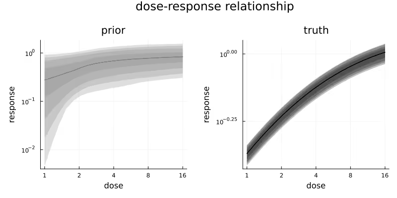
Figure 2 visualizes the simulated latent concentration trajectories of our quantity of interest for the middle dose group. Every curved line represents the response for one patient in this dose group. Dosing happens at time = 0. The horizontal red line represents the LLOQ at 0.1 and the horizontal purple line represents LLOQ/2.
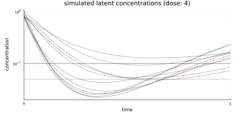
Table 1 summarizes the key characteristics of the simulated observations generated for the different dose groups. The fraction of censored observations rises from 7% for the lowest dose to 80% for the highest dose, with an overall fraction of 47% of the observations censored.
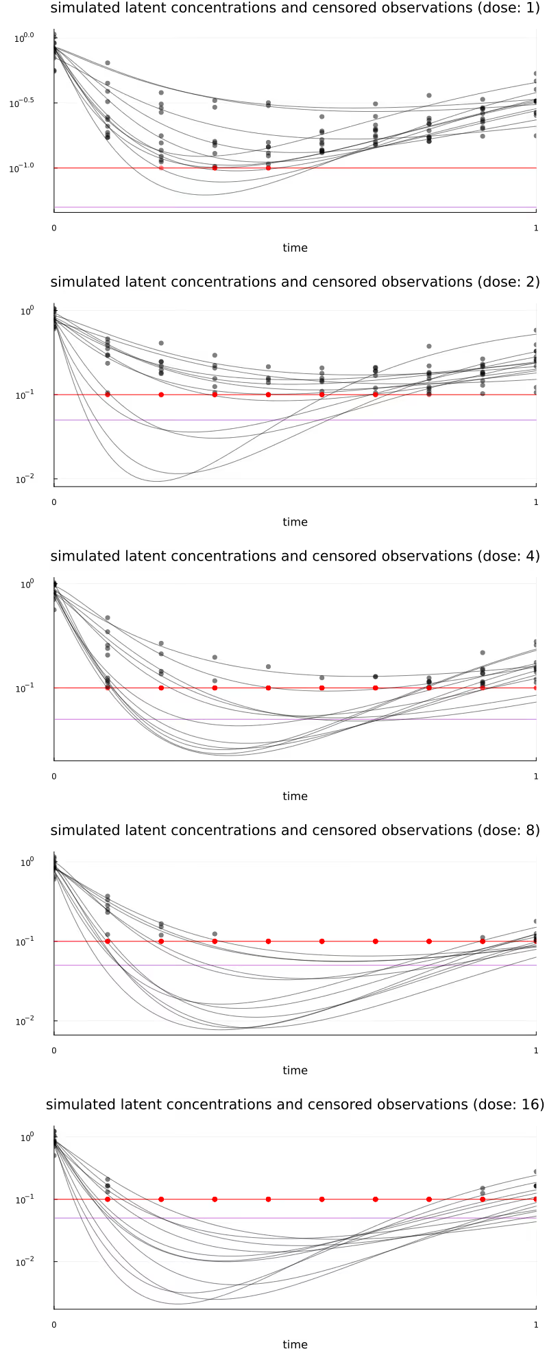
Figure 11 (at the very bottom of this post) visualizes all subject-level concentration trajectories and observations, stratified by dose.
The three different methods of handling censored observations (“BQL observations”) that we will be comparing are commonly known as M1, M3, and M5, going back to Beal (2001) [1]. These methods are, in short,
Using our standard analysis pipeline, implementing M3 for arbitrary likelihoods is of course not significantly more difficult than implementing M1 or M5. Throughout the rest of this post, M1 will generally be represented using orange, M3 will be blue, M5 will be purple, and the underlying known truth will be black. All upcoming visualizations use full Bayesian inference, i.e. are generated from draws from the different posteriors obtained via Markov Chain Monte Carlo.
Obviously, if no observations are censored at all, all considered methods will be equivalent. Similarly, the difference between the methods will be more significant if there is a larger fraction of censored observations. For this first part, we will only condition on observations from the first/lowest dose group. With only 8 out of 110 observations censored, we do not expect large differences between the methods, and this is indeed what we observe below.
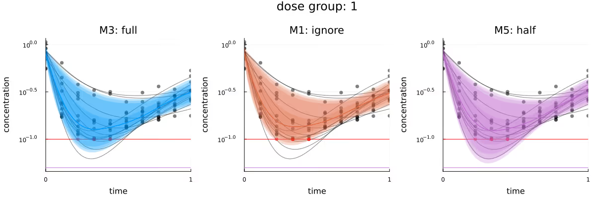
Figure 3 visualizes the different inferred latent concentration trajectories for dose group 1 for the three different methods. Based on the plots of the CrIs of these trajectories, the three methods are in broad agreement. If any method seems to have an advantage, it would be M5, as its visualized CrIs are the only ones which overlap with the deepest trough in this dose group. M5 appearing to slightly outperform the other methods is probably because the replacement of the few BQL observations by LLOQ / 2 “encourages” the posterior to be compatible with stronger responses, relative to the other methods.
M1 and M3 not covering these deeper troughs as well is probably due to the always present compromise between the prior of a model and the likelihood of the observations given that model - the observations conditioned on so far simply do not contain enough information to move the posterior further away from the prior. This is also compatible with the posterior for M1, which is missing the 8 censored observations, performing “worse” than M3 - because the posterior of M1 remains closer to the prior.
A similar picture emerges when comparing Q-Q plots for the different methods, as visualized in Figure 4, though any potential advantage of M5 seems to be less apparent. In this plot, as well as the upcoming Figure 9, grey dots represent observations which were not conditioned on. As in Figure 3, the methods appear to be in broad agreement.
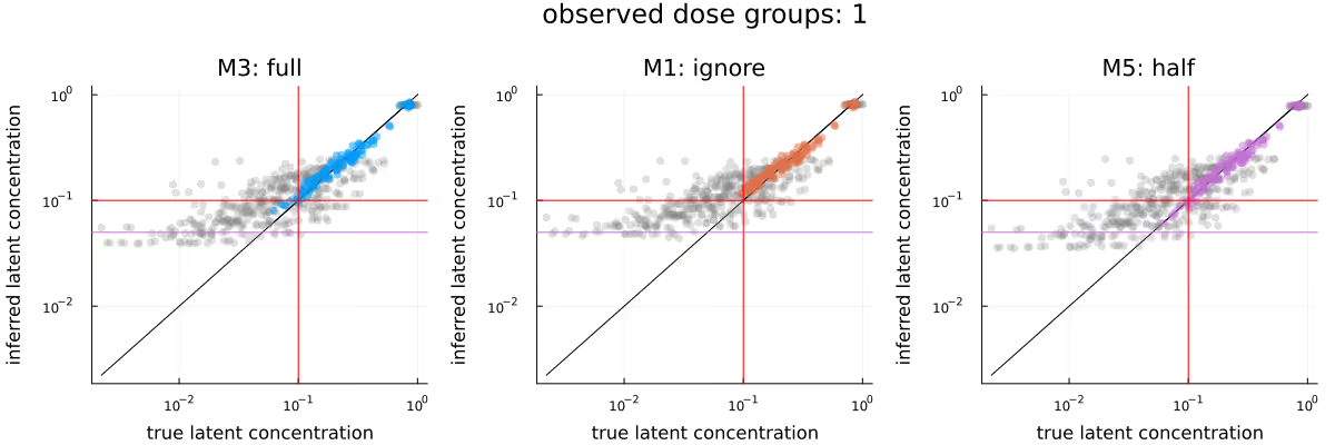
Figure 5 visualizes the inferred dose-response relationship, comparing the underlying truth (leftmost subplot) with the posteriors due to the different methods. As before, the methods appear to be in broad agreement, with M3 maybe providing tighter estimates than M1, and M5 maybe being shifted downwards slightly compared to M1 and M3.

A common quantity of interest is the (average) relative maximal change from baseline (usually out-of-sample), which incorporates the subject-specific baselines. Figure 6 compares the in-sample relative maximal change from baseline, again comparing the underlying truth (leftmost subplot) with the posteriors due to the different methods. As before, the methods appear to be in broad agreement, with this time no immediately obvious difference between the methods.

The previous broad agreement between the methods disappears once we condition on all of the data - which is a) to be expected as the fraction of BQL observations rises dramatically, but also b) by construction, otherwise this blog post would be kind of pointless.
Figure 7 is the analogue to Figure 6, with the difference between the two figures being the amount of data we condition on (only data from the lowest dose group in the latter, all data in the former). Here, there is a clear difference between the three methods, with the posterior due to M3 being closest to the ground truth, the posterior due to M1 being similar to the one due to M3 if wider, and the posterior due to M5 clearly being biased.

Figure 8 is the analogue to Figure 5, with the difference between the methods being less pronounced than in Figure 7, but still visible.

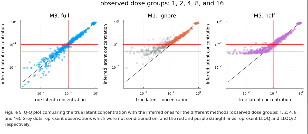
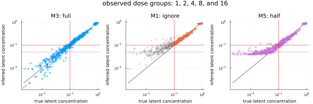
Figure 9 is the analogue to Figure 4, with the difference between the methods being extremely obvious - M3 is clearly very well calibrated, M1 has not moved far enough away from the prior yet due to the omission of a large fraction of observations, and M5 is clearly biased due to the replacement of the BQL observations with LLOQ / 2. Again, as previously in Figure 4, grey dots represent observations which were not conditioned on.
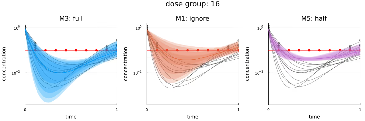
Finally, Figure 10 visualizes the different inferred latent concentration trajectories for dose group 16 for the three different methods, when conditioning on all data. As in the previous plots in this section, the bias introduced by both M1 and M5 is clearly visible, with the only method “perfectly” calibrated being M3.
As was probably obvious already from the subtitle, we have been able to observe how mishandling censored observations can introduce significant biases into our statistical methods. Doing “proper” joint modelling of all data should generally be the best way to make inferences and the downstream decisions dependent on the statistical analysis - at least it has been in this case study.
The big caveat is of course model misspecification. For this case study, the data generating process and the model used to fit the generated data have been identical, yielding the wonderfully calibrated posterior predictions visible e.g. in Figure 10. Generally, and especially for these kinds of settings where you have to essentially extrapolate into unobserved regions, the importance of the prior and the model cannot be overstated. Development of appropriate models and priors will generally involve iterative model development, critique, abandonment and extension.
Finally, to generate this blog post with (in my opinion) aesthetically pleasing and statistically interesting figures, some iteration and data and model selection has been necessary. Bayesian inference is hard!
Figure 11 visualizes all subject-level trajectories (curved lines) and the corresponding generated observations (dots), stratified by dose, with censored observations highlighted in red. The horizontal red line again represents the LLOQ at 0.1 and the horizontal purple line represents LLOQ/2
[1] Beal, Stuart L. 2001. “Ways to Fit a PK Model with Some Data Below the Quantification Limit.” Journal of Pharmacokinetics and Pharmacodynamics 28 (5): 481–504. https://doi.org/10.1023/A:1012299115260.
[2] Bergstrand, Martin, and Mats O. Karlsson. 2009. “Handling Data Below the Limit of Quantification in Mixed Effect Models.” The AAPS Journal 11 (2): 371–80. https://doi.org/10.1208/s12248-009-9112-5.
[3] Bezanson, Jeff, Alan Edelman, Stefan Karpinski, and Viral B. Shah. 2017. “Julia: A Fresh Approach to Numerical Computing.” SIAM Review 59 (1): 65–98. https://doi.org/10.1137/141000671.
[4] Carpenter, Bob, Andrew Gelman, Matthew D. Hoffman, Daniel Lee, Ben Goodrich, Michael Betancourt, Marcus Brubaker, Jiqiang Guo, Peter Li, and Allen Riddell. 2017. “Stan : A Probabilistic Programming Language.” Journal of Statistical Software 76 (1). https://doi.org/10.18637/jss.v076.i01.
This is a comment related to the post above. It was submitted in a form, formatted by Make, and then approved by an admin. After getting approved, it was sent to Webflow and stored in a rich text field.
This is a comment related to the post above. It was submitted in a form, formatted by Make, and then approved by an admin. After getting approved, it was sent to Webflow and stored in a rich text field.
This is a comment related to the post above. It was submitted in a form, formatted by Make, and then approved by an admin. After getting approved, it was sent to Webflow and stored in a rich text field.
This is a comment related to the post above. It was submitted in a form, formatted by Make, and then approved by an admin. After getting approved, it was sent to Webflow and stored in a rich text field.
This is a comment related to the post above. It was submitted in a form, formatted by Make, and then approved by an admin. After getting approved, it was sent to Webflow and stored in a rich text field.
This is a comment related to the post above. It was submitted in a form, formatted by Make, and then approved by an admin. After getting approved, it was sent to Webflow and stored in a rich text field.
This is a comment related to the post above. It was submitted in a form, formatted by Make, and then approved by an admin. After getting approved, it was sent to Webflow and stored in a rich text field.
This is a comment related to the post above. It was submitted in a form, formatted by Make, and then approved by an admin. After getting approved, it was sent to Webflow and stored in a rich text field.
This is a comment related to the post above. It was submitted in a form, formatted by Make, and then approved by an admin. After getting approved, it was sent to Webflow and stored in a rich text field.
This is a comment related to the post above. It was submitted in a form, formatted by Make, and then approved by an admin. After getting approved, it was sent to Webflow and stored in a rich text field.
This is a comment related to the post above. It was submitted in a form, formatted by Make, and then approved by an admin. After getting approved, it was sent to Webflow and stored in a rich text field.
This is a comment related to the post above. It was submitted in a form, formatted by Make, and then approved by an admin. After getting approved, it was sent to Webflow and stored in a rich text field.
This is a comment related to the post above. It was submitted in a form, formatted by Make, and then approved by an admin. After getting approved, it was sent to Webflow and stored in a rich text field.
This is a comment related to the post above. It was submitted in a form, formatted by Make, and then approved by an admin. After getting approved, it was sent to Webflow and stored in a rich text field.
This is a comment related to the post above. It was submitted in a form, formatted by Make, and then approved by an admin. After getting approved, it was sent to Webflow and stored in a rich text field.
This is a comment related to the post above. It was submitted in a form, formatted by Make, and then approved by an admin. After getting approved, it was sent to Webflow and stored in a rich text field.
This is a comment related to the post above. It was submitted in a form, formatted by Make, and then approved by an admin. After getting approved, it was sent to Webflow and stored in a rich text field.
This is a comment related to the post above. It was submitted in a form, formatted by Make, and then approved by an admin. After getting approved, it was sent to Webflow and stored in a rich text field.
This is a comment related to the post above. It was submitted in a form, formatted by Make, and then approved by an admin. After getting approved, it was sent to Webflow and stored in a rich text field.
This is a comment related to the post above. It was submitted in a form, formatted by Make, and then approved by an admin. After getting approved, it was sent to Webflow and stored in a rich text field.
This is a comment related to the post above. It was submitted in a form, formatted by Make, and then approved by an admin. After getting approved, it was sent to Webflow and stored in a rich text field.
This is a comment related to the post above. It was submitted in a form, formatted by Make, and then approved by an admin. After getting approved, it was sent to Webflow and stored in a rich text field.
This is a comment related to the post above. It was submitted in a form, formatted by Make, and then approved by an admin. After getting approved, it was sent to Webflow and stored in a rich text field.
This is a comment related to the post above. It was submitted in a form, formatted by Make, and then approved by an admin. After getting approved, it was sent to Webflow and stored in a rich text field.

Weighing pros and cons of NCA vs. PK modeling.

This is a comment related to the post above. It was submitted in a form, formatted by Make, and then approved by an admin. After getting approved, it was sent to Webflow and stored in a rich text field.